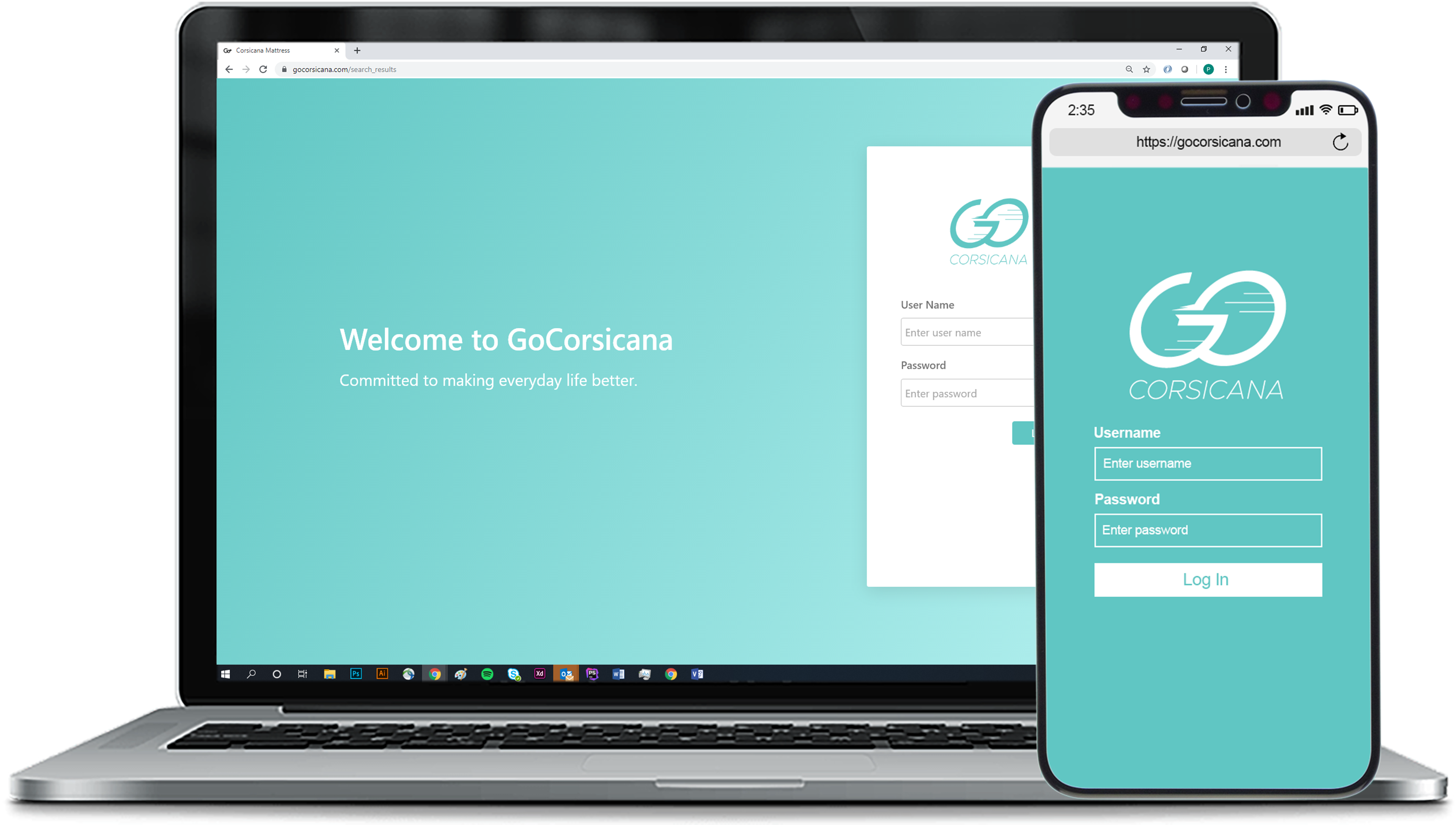
GoCorsicana (2020)
Order Tracker (2018)
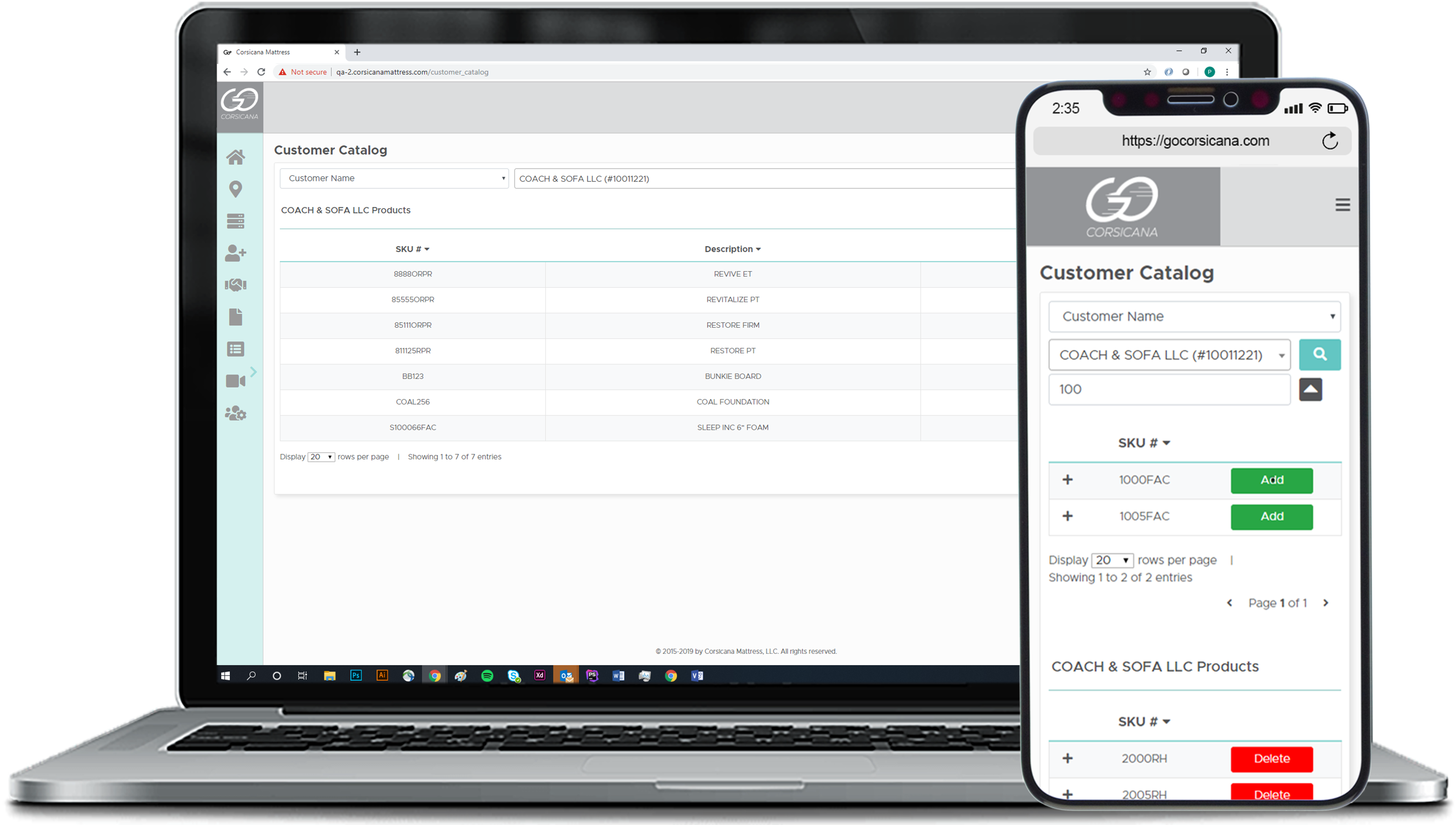
Customer Catalog (2019)
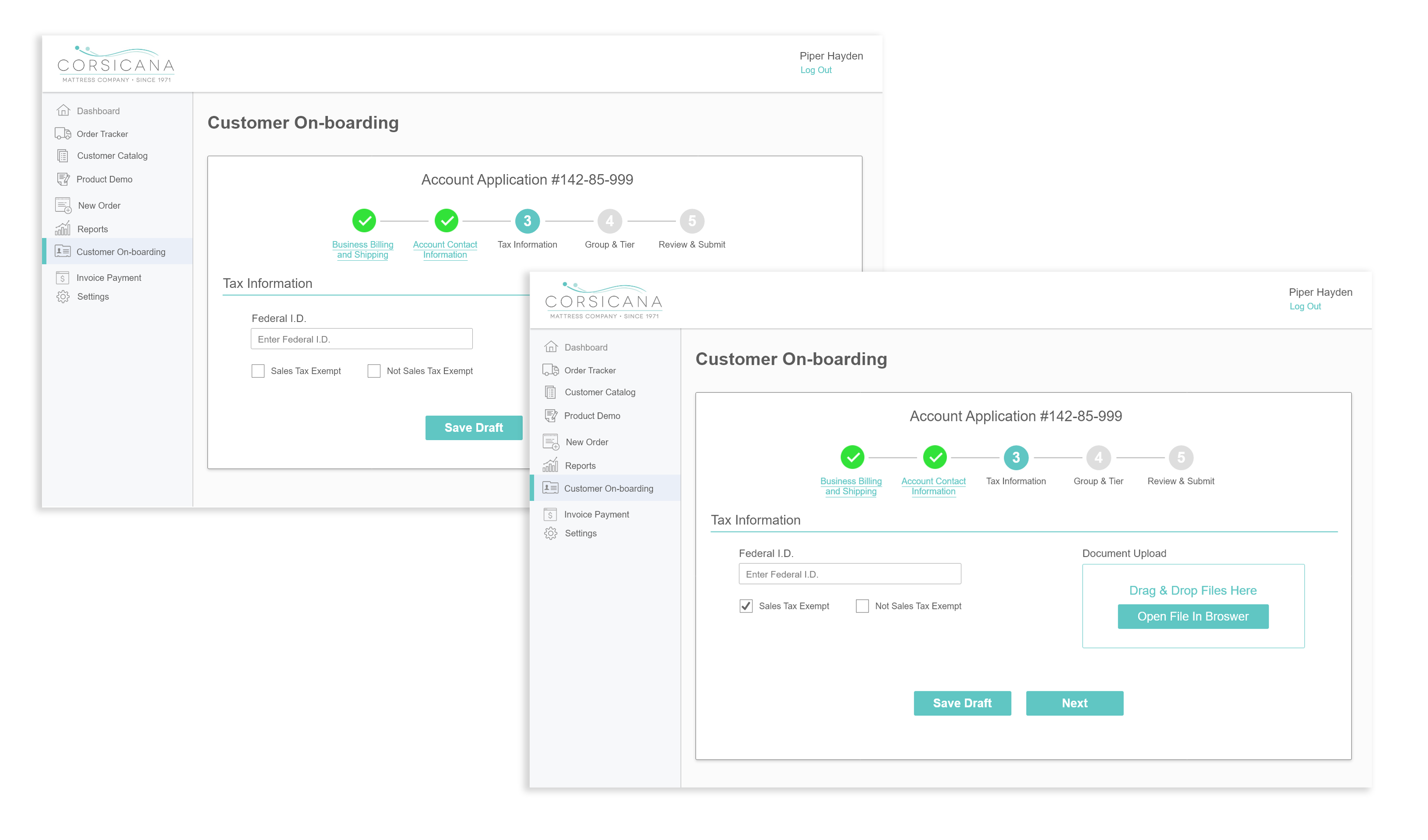
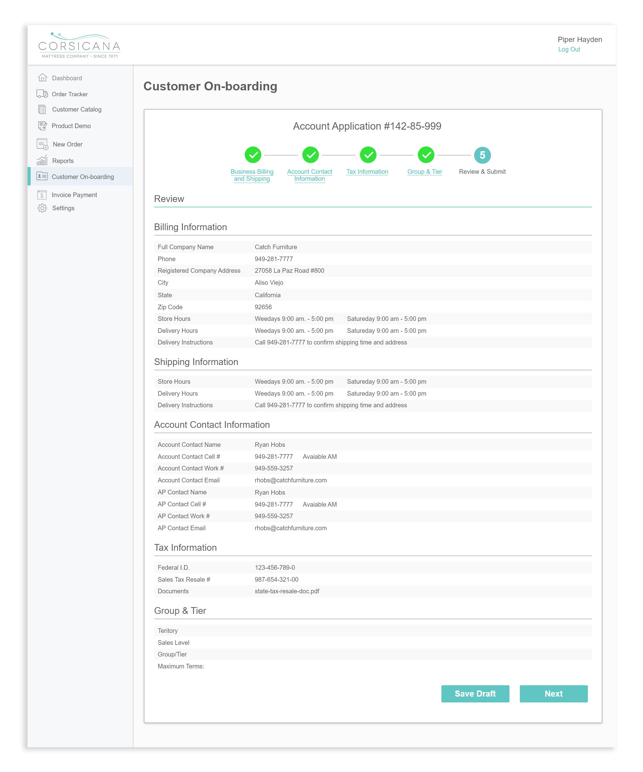
Customer Onboarding (2019)
About GoCorsicana
GoCorsicana is a proprietary role based platform for internal and business to business use.
Reasoning
Sales reps and managers are to expected increase market share while maintaining current customer relations. However, Corsicana Mattresses (CM) processes have become outdated and inefficient causing the use of unnecessary department resources. By redesigning Corsicana Mattress’s business approach, GoCorsicana will be able to help customers more effectively, increase market share, build a stronger brand, increase credibility and reputation, and become more cost efficient.Objective
To designed and helped develop a role based online portal that aggregates reports and business applications in to one easily accessible location.Approach
To create the portal my lead architect and business analyst first outlined the infrastructure between the company’s enterprise software, tracking software and the future web application. Once the architecture was finalized, I researched other SAAS applications and their service interfaces. After analyzing other applications, I was able to create low fidelity mock-ups of the portal’s interface using photoshop and XD. My team members and I then discussed the pros and cons of the mock-ups and decided on the most efficient interface design. Once this decision was made, I worked with my senior front-end developer to build the portal’s APIs and interface.Role
- User Interface Designer
- Content Designer
- Front End Developer
Research
Research
Before creating detailed mock-ups, I reviewed other SAAS applications. My goal was to understand what type of interface design was most commonly used. By comparing other websites I was able to get an insight into what other company's viewed as the best user experience.I discovered that data and text heavy SAAS applications have the following commonalities.
- Compatible with multiple browsers
- Responsive and mobile friendly
- Light template themes
- Collapsible or thin navigation
- Initial high level dashboard
Implementation
Based on my research, I was able to outline important features necessary to create an efficient portal interface.Accessibility
- Easy authentication and password manager
- Intuitive navigation
- Minimalistic
- Device and browser compatibility
Content
- Initial dashboard
- Analytic reports
- Business applications
Designs
Transformation
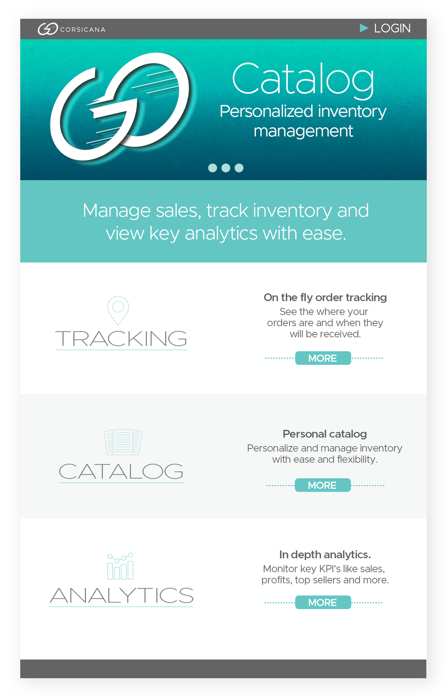
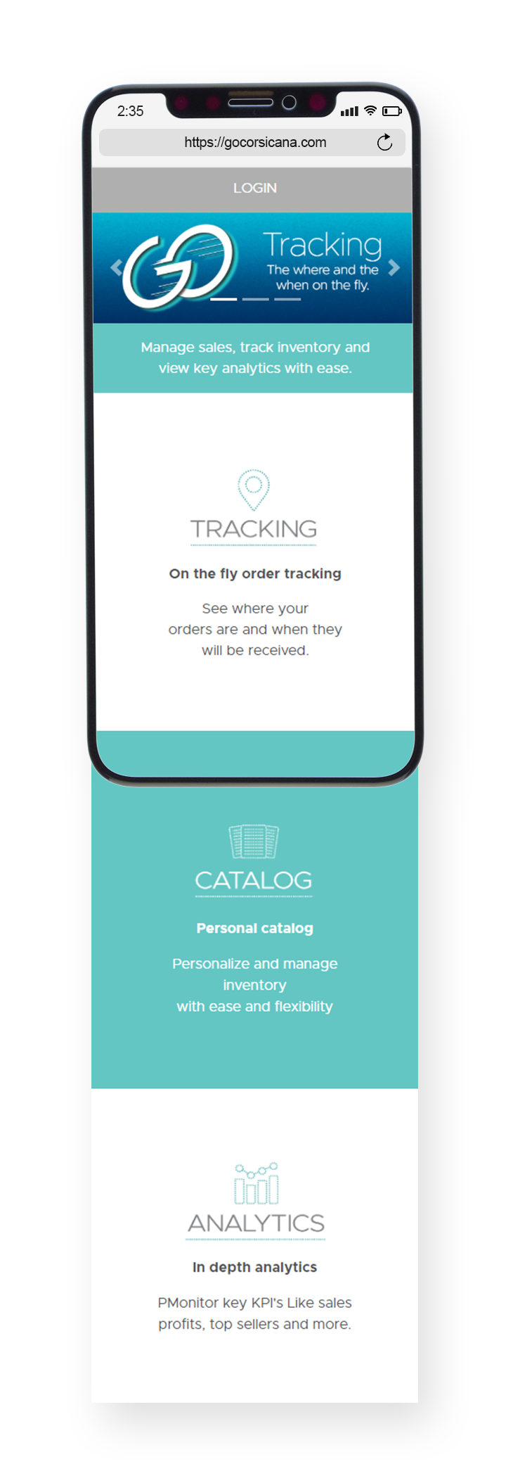
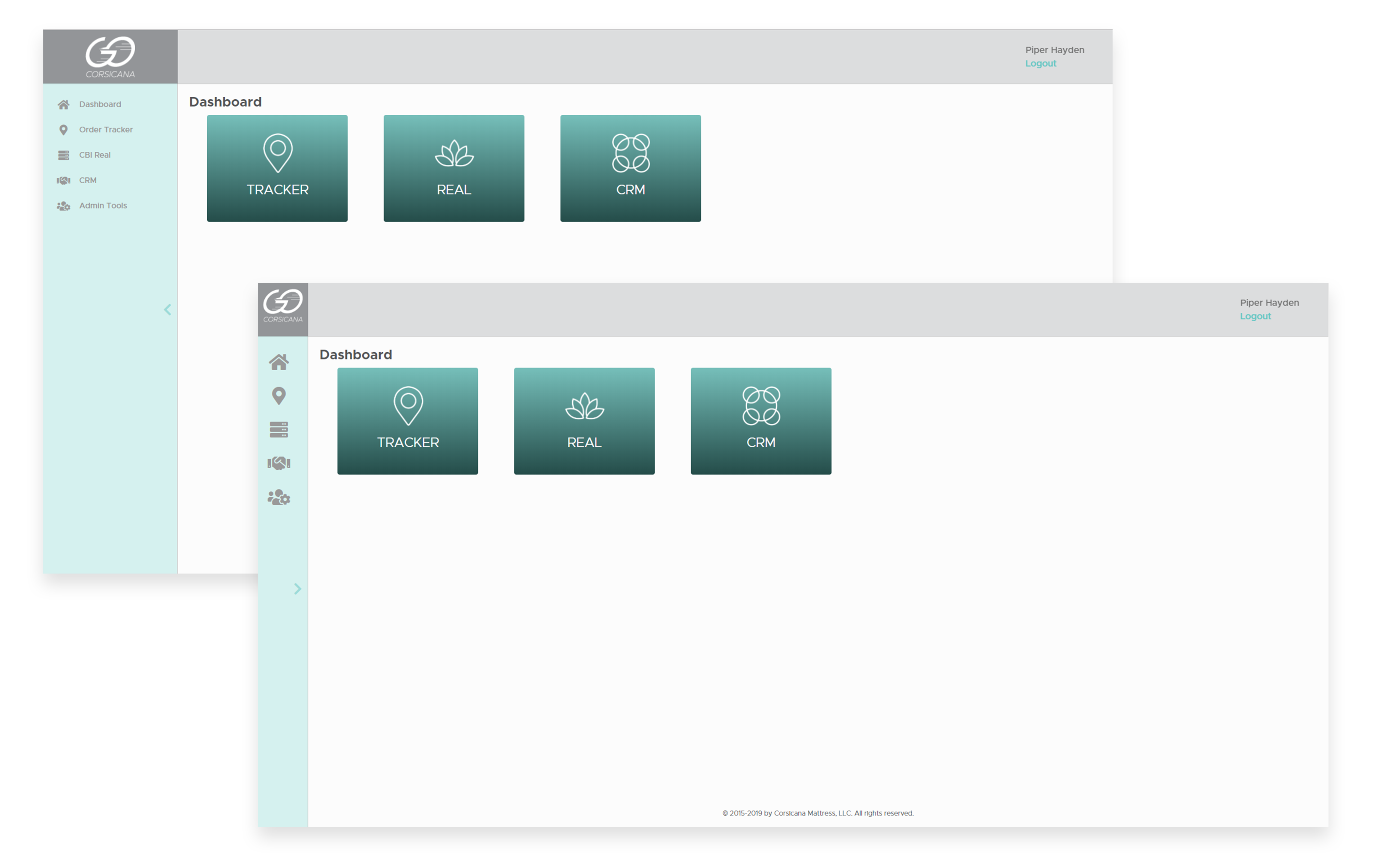
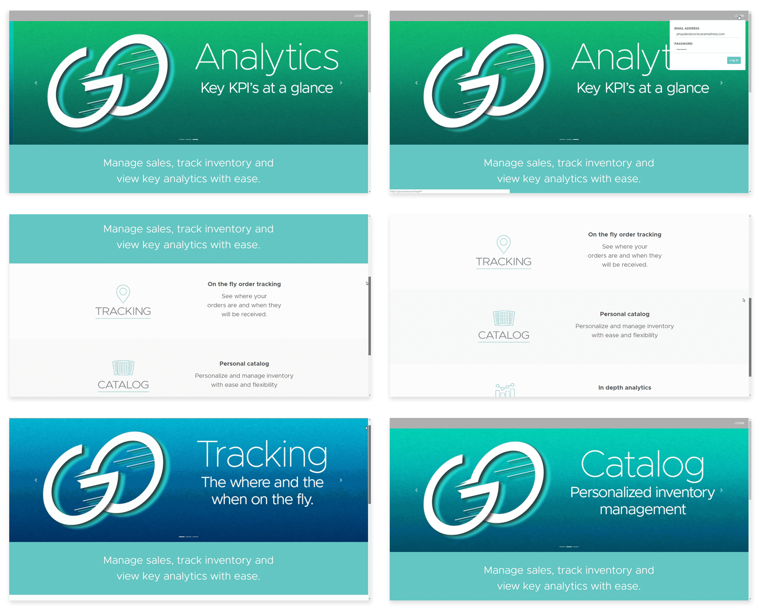
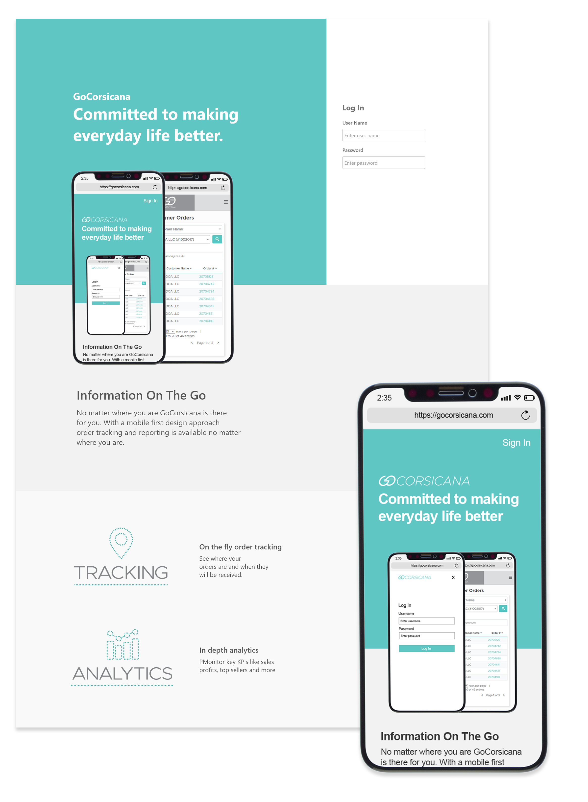
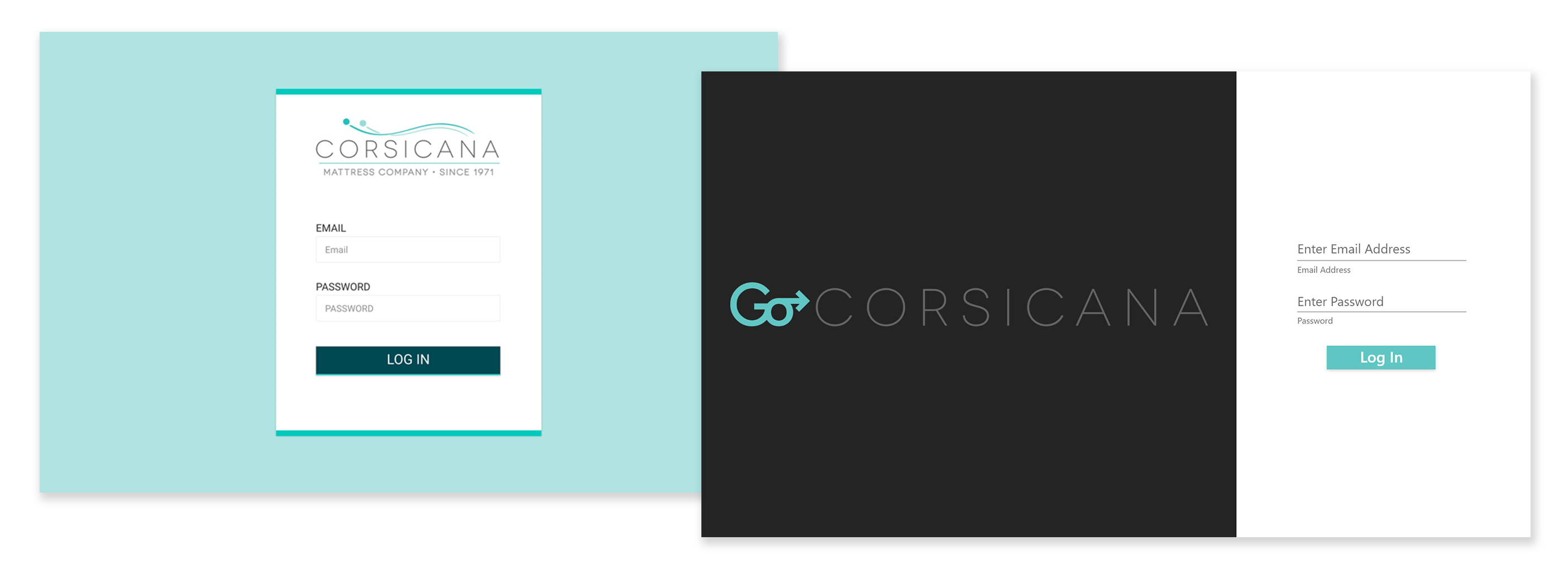
The initial mock-ups for both the log in screen and the portal template went through multiple iterations. As the portal itself developed so did the message. A decision was made to take advantage of the login page's real estate by including the portal's purpose and current services.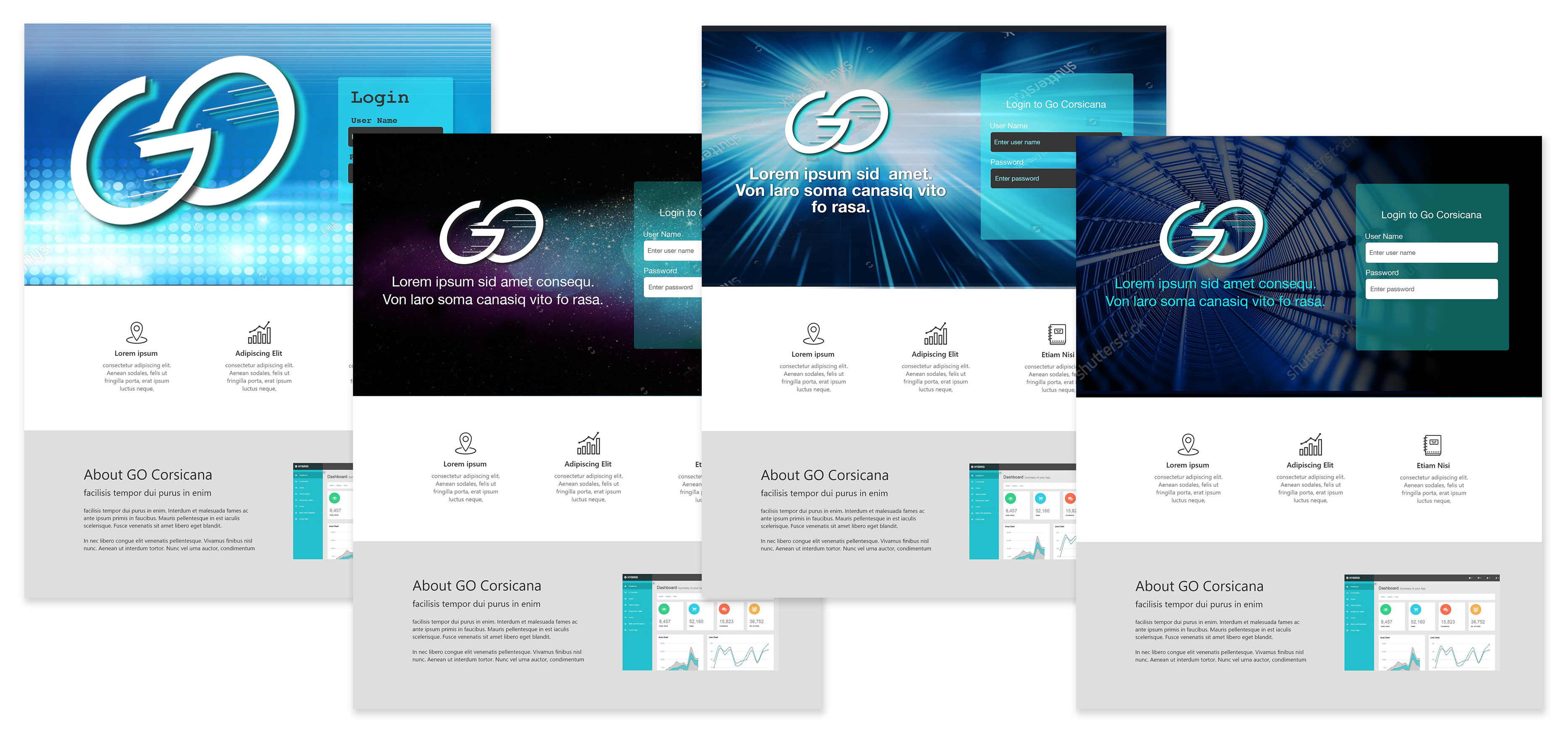
PRODUCT
Responsiveness
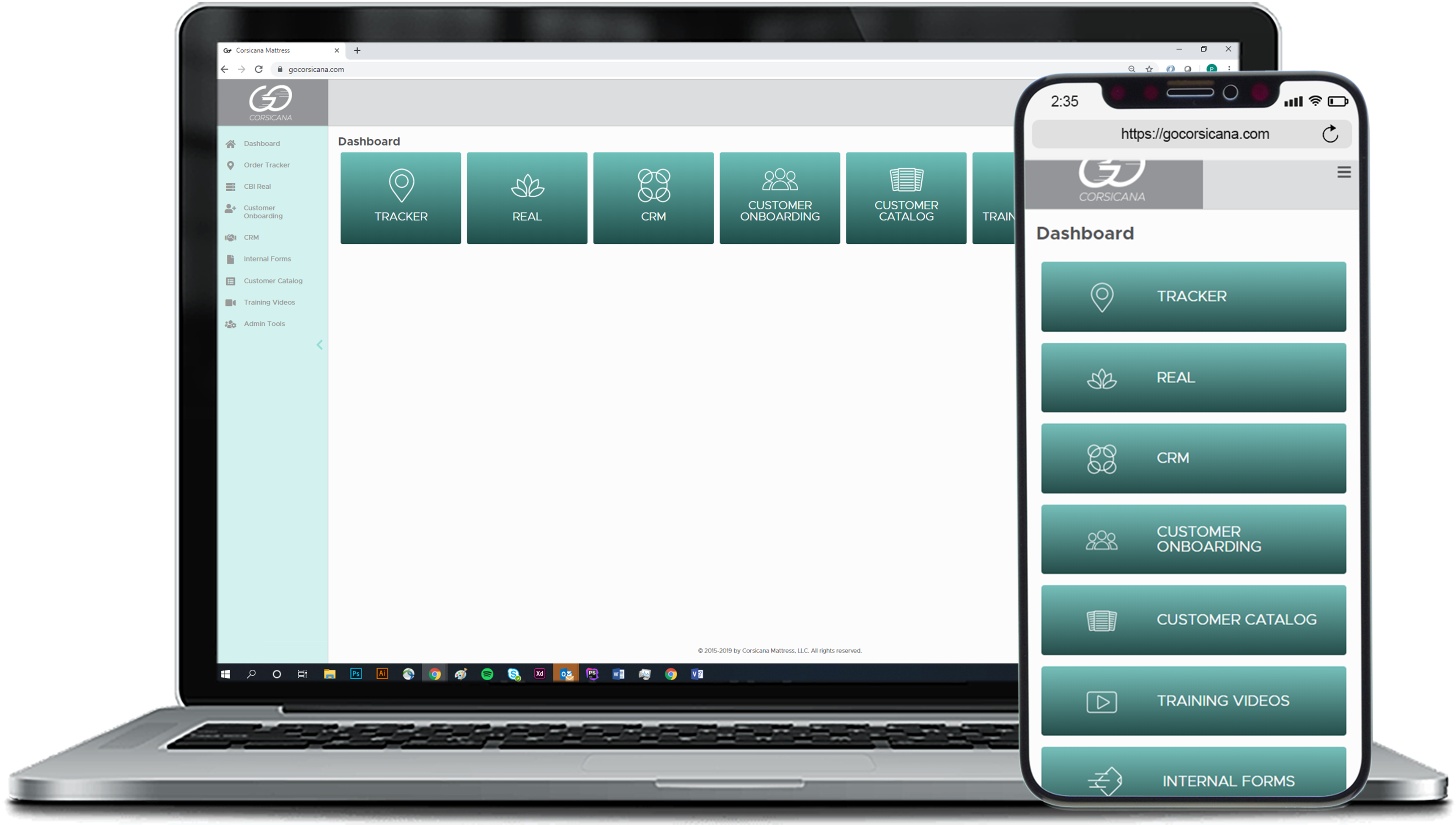
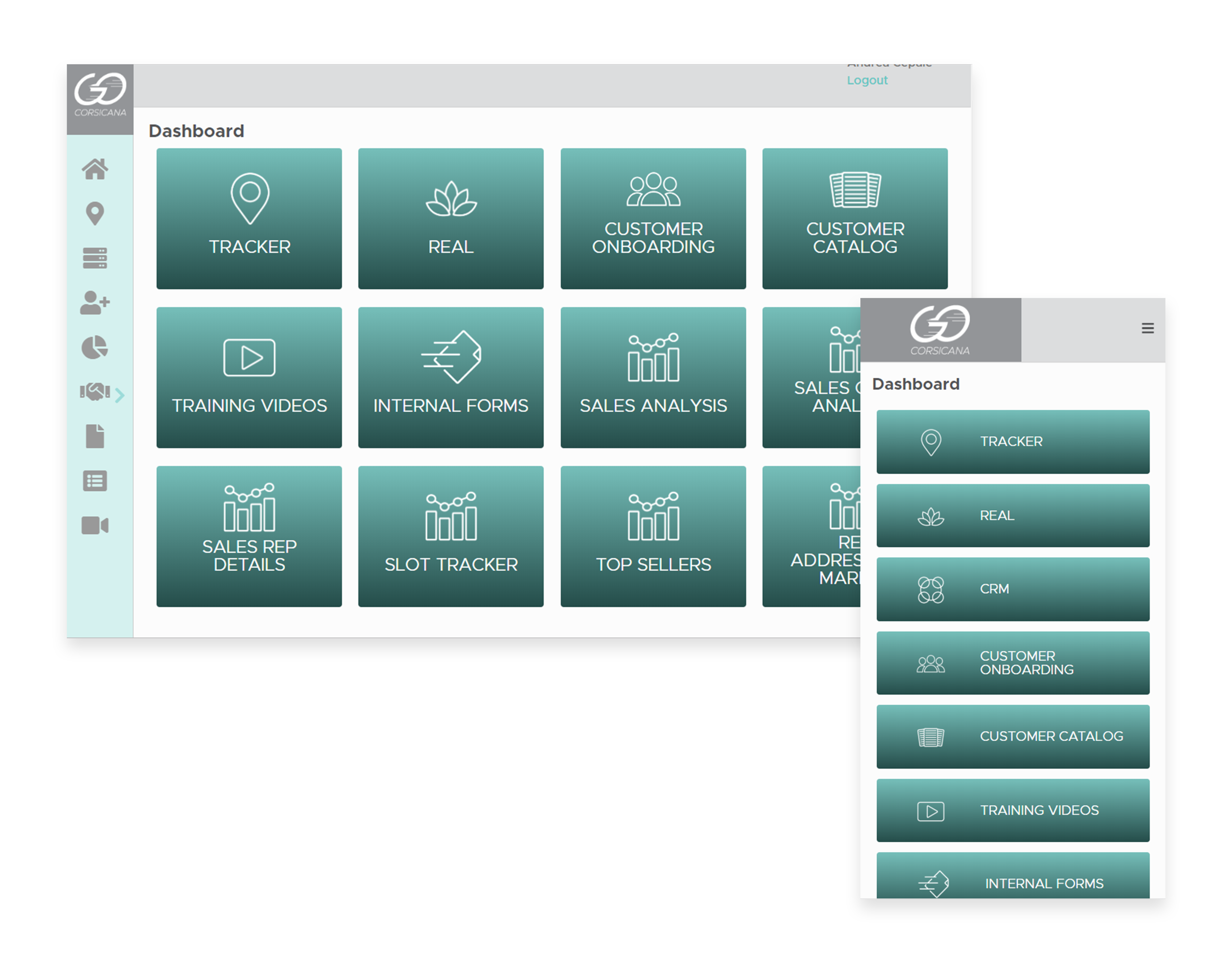
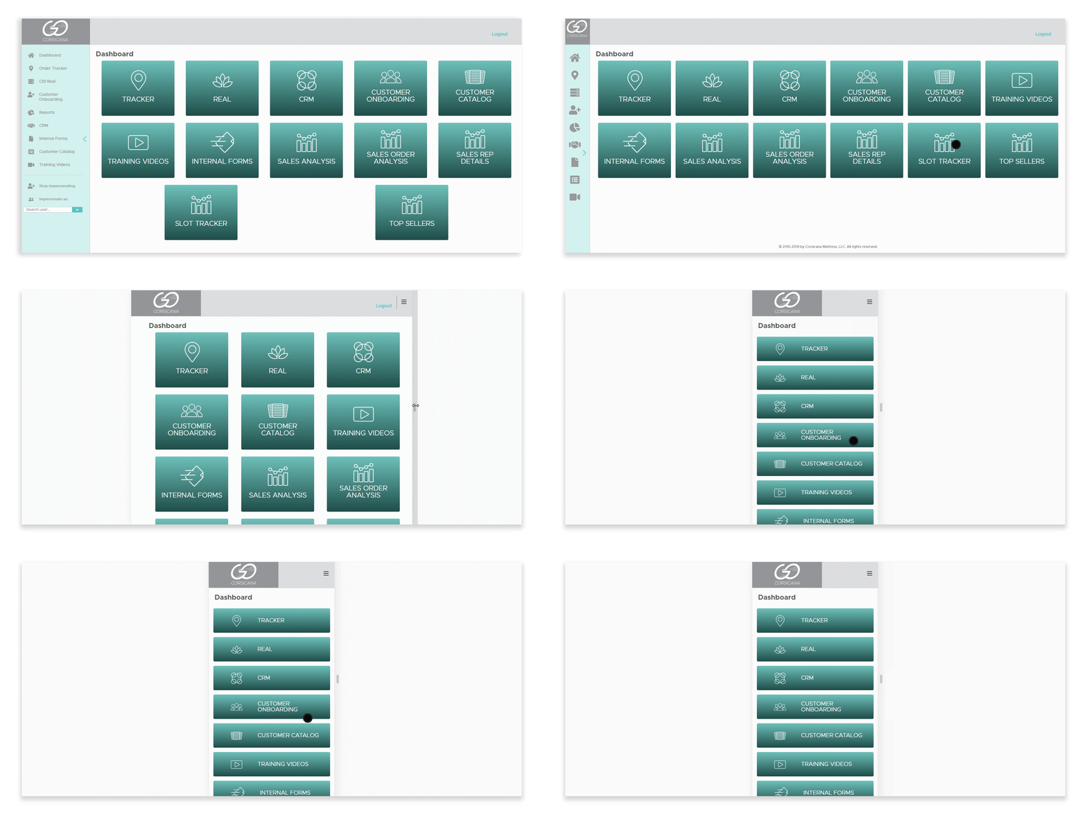
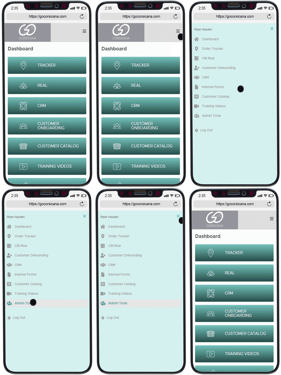
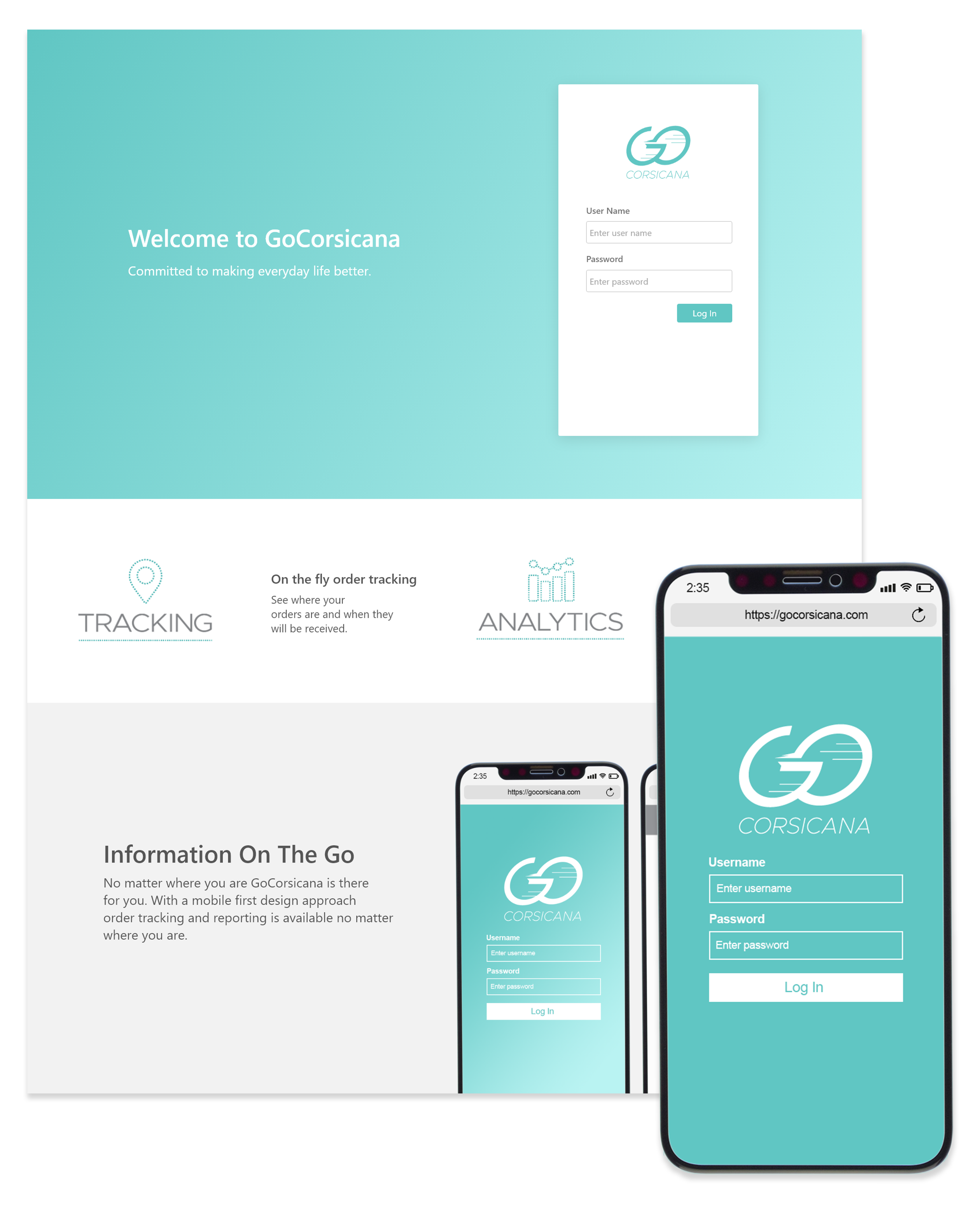
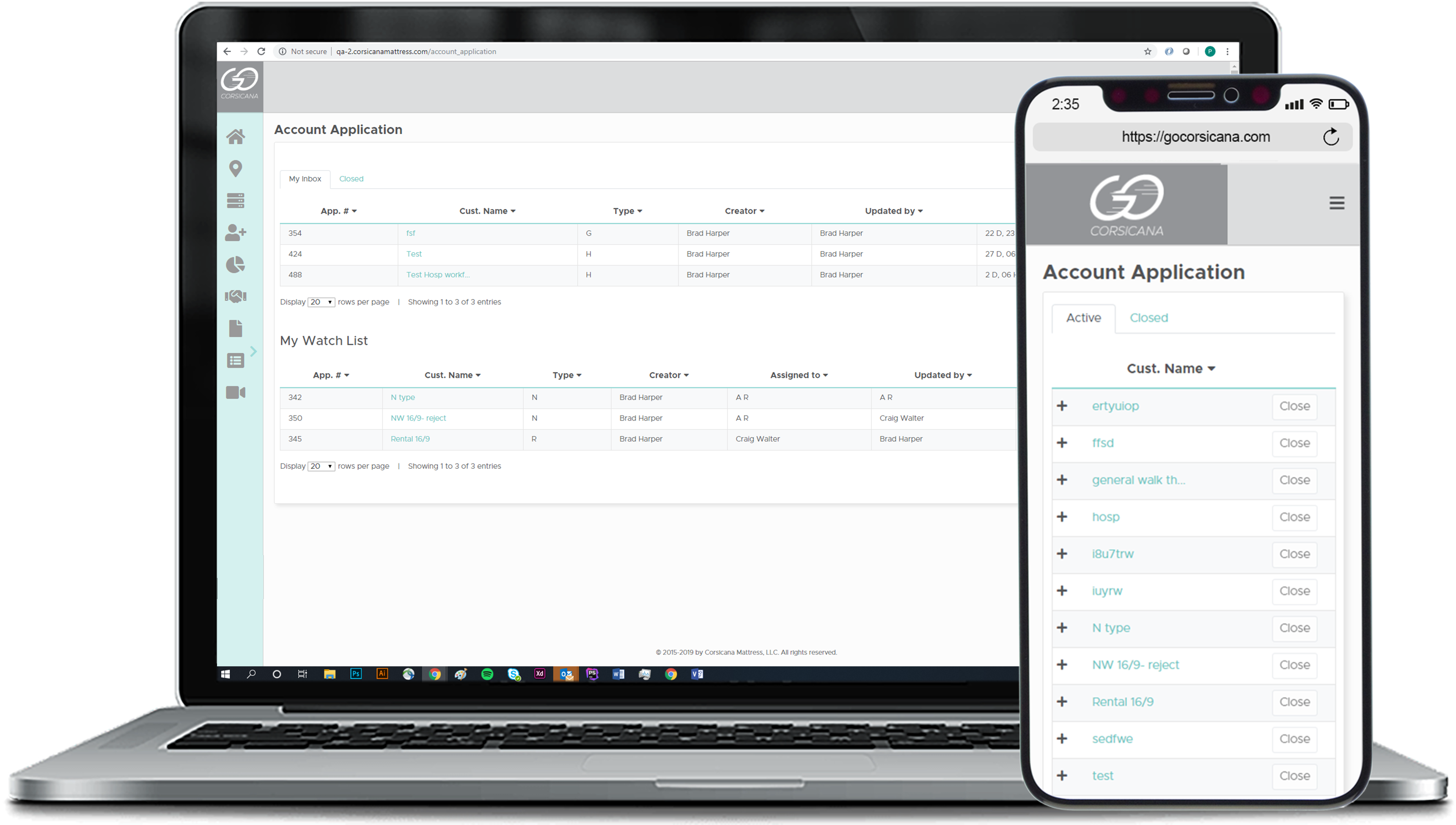
A major design requirement was assuring the portal and its applications were compatible with different web browsers, operating systems, and devices. This was also one of the biggest frustrations. As the portal developed, the more mobile friendly and compatible it became.FUTURE
New Look
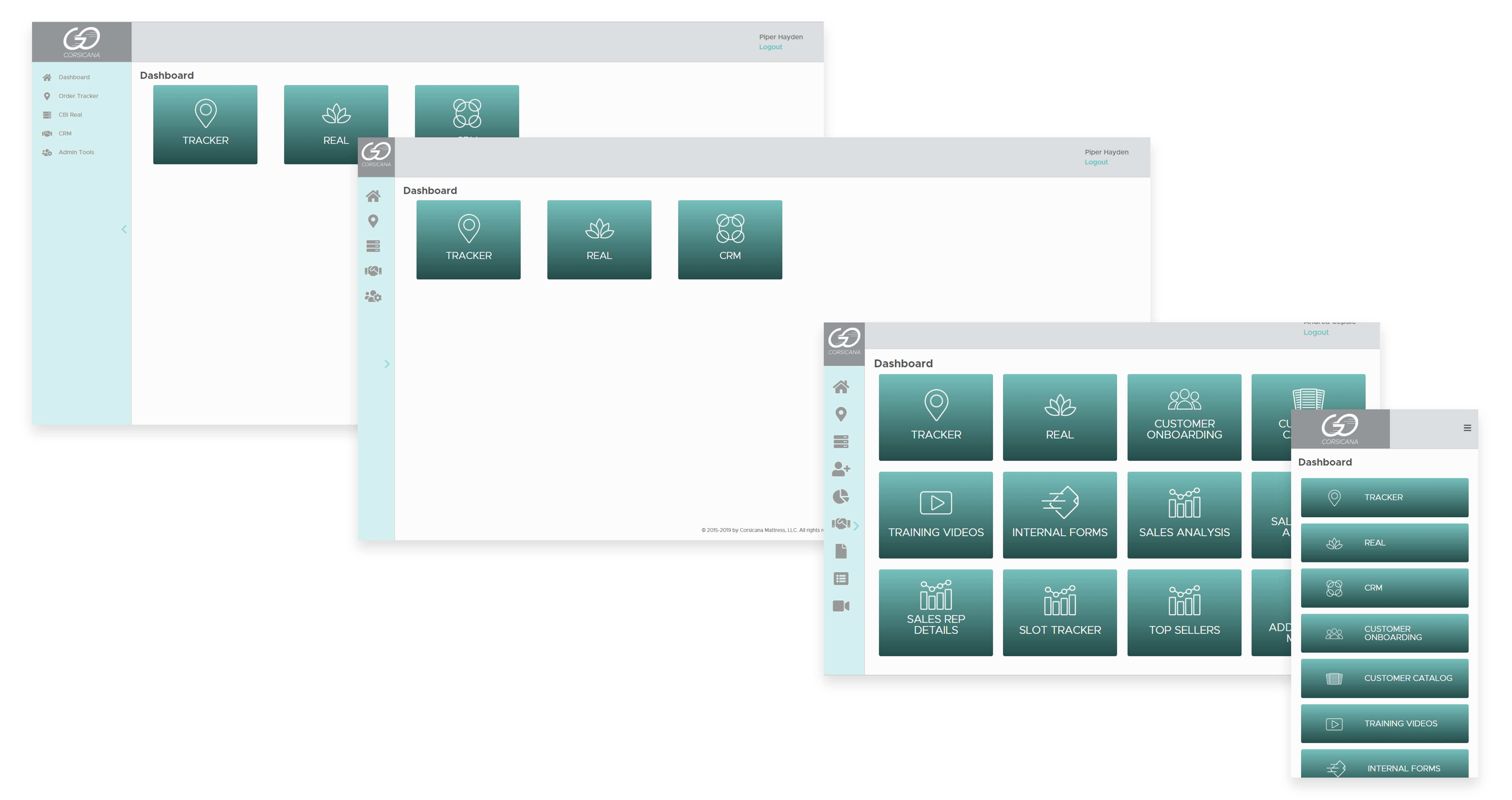
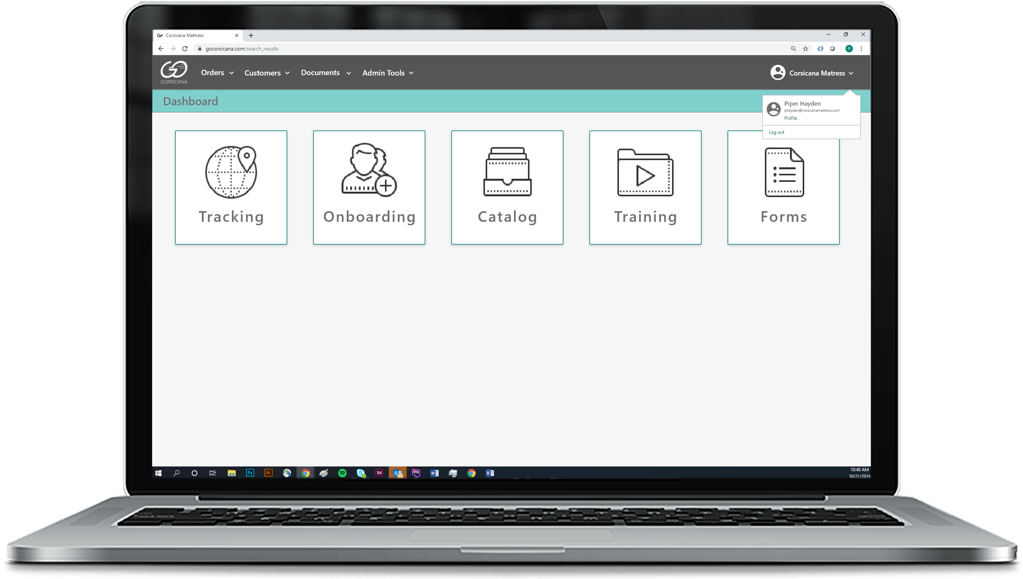
The portal was rebranded with the intention of incorporating future users and applications. To do this, the portal’s log in screen was simplified to be relevant to all users, and the template was redesigned to allow more room for main content.About Order Tracker
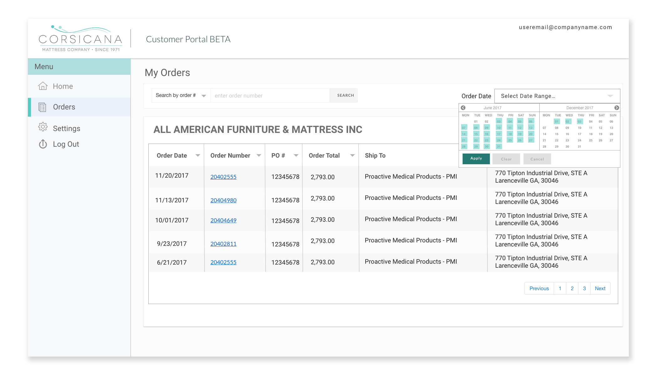
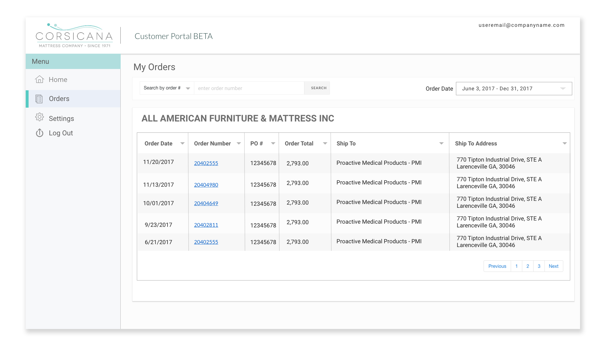
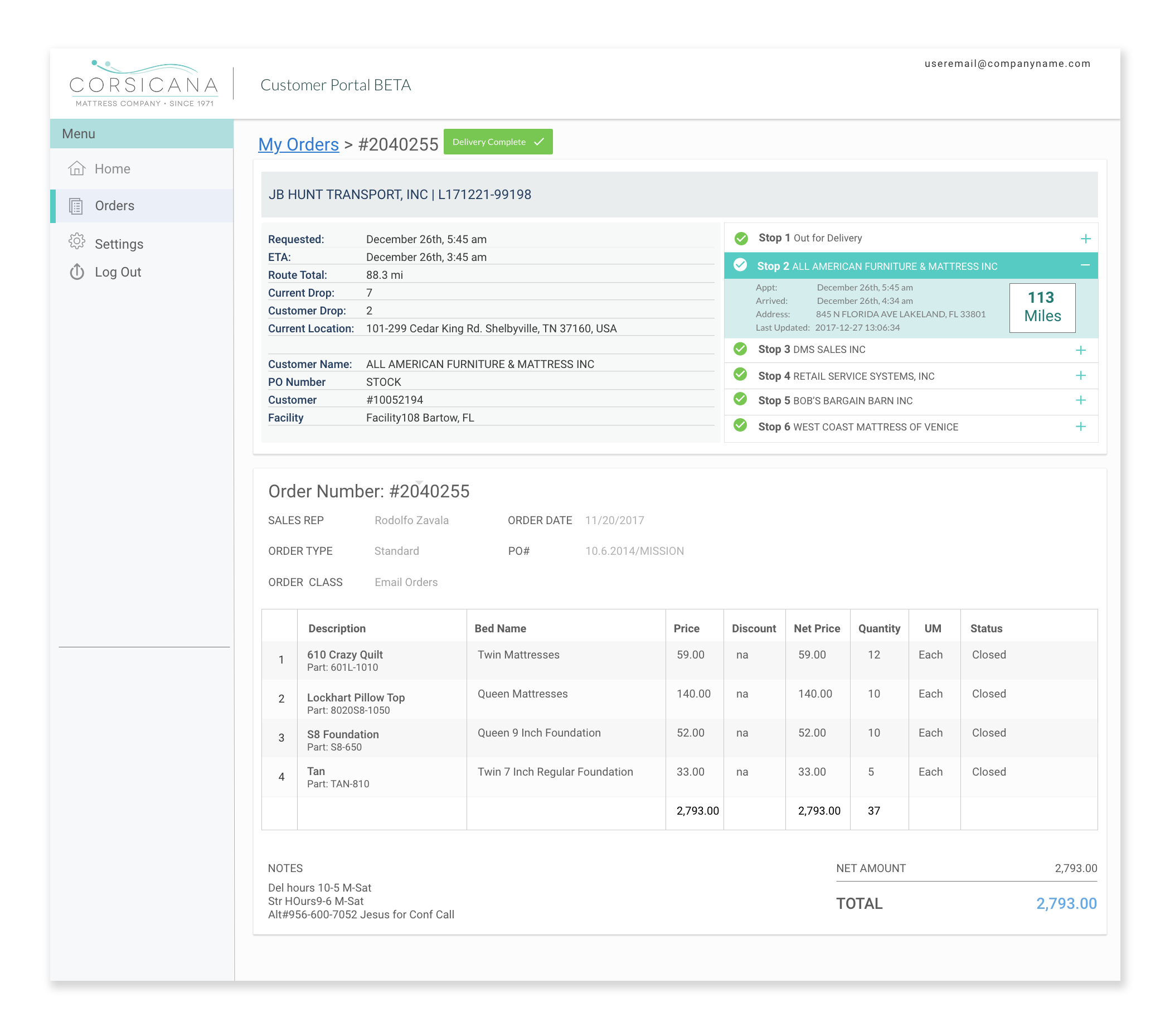
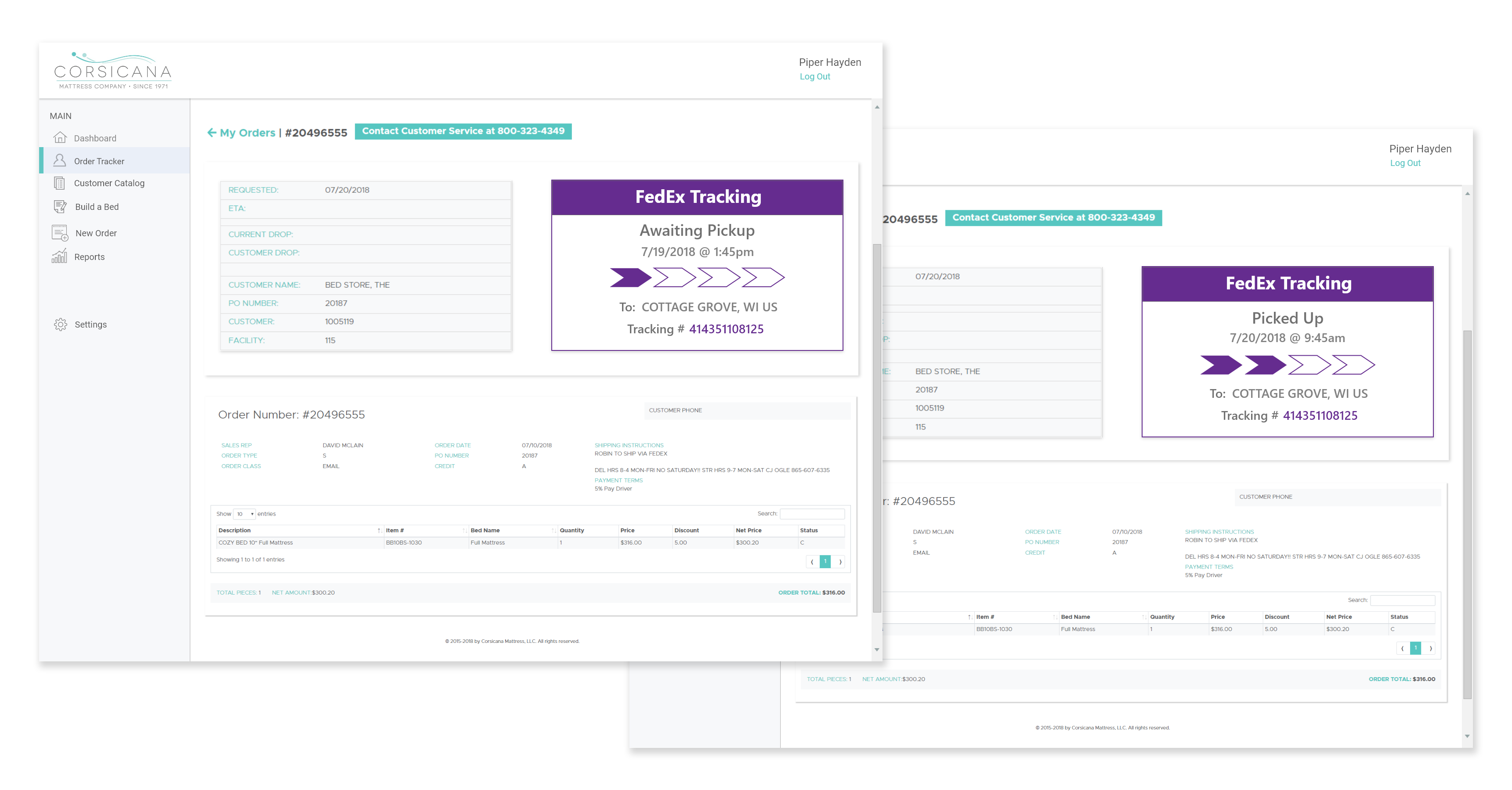
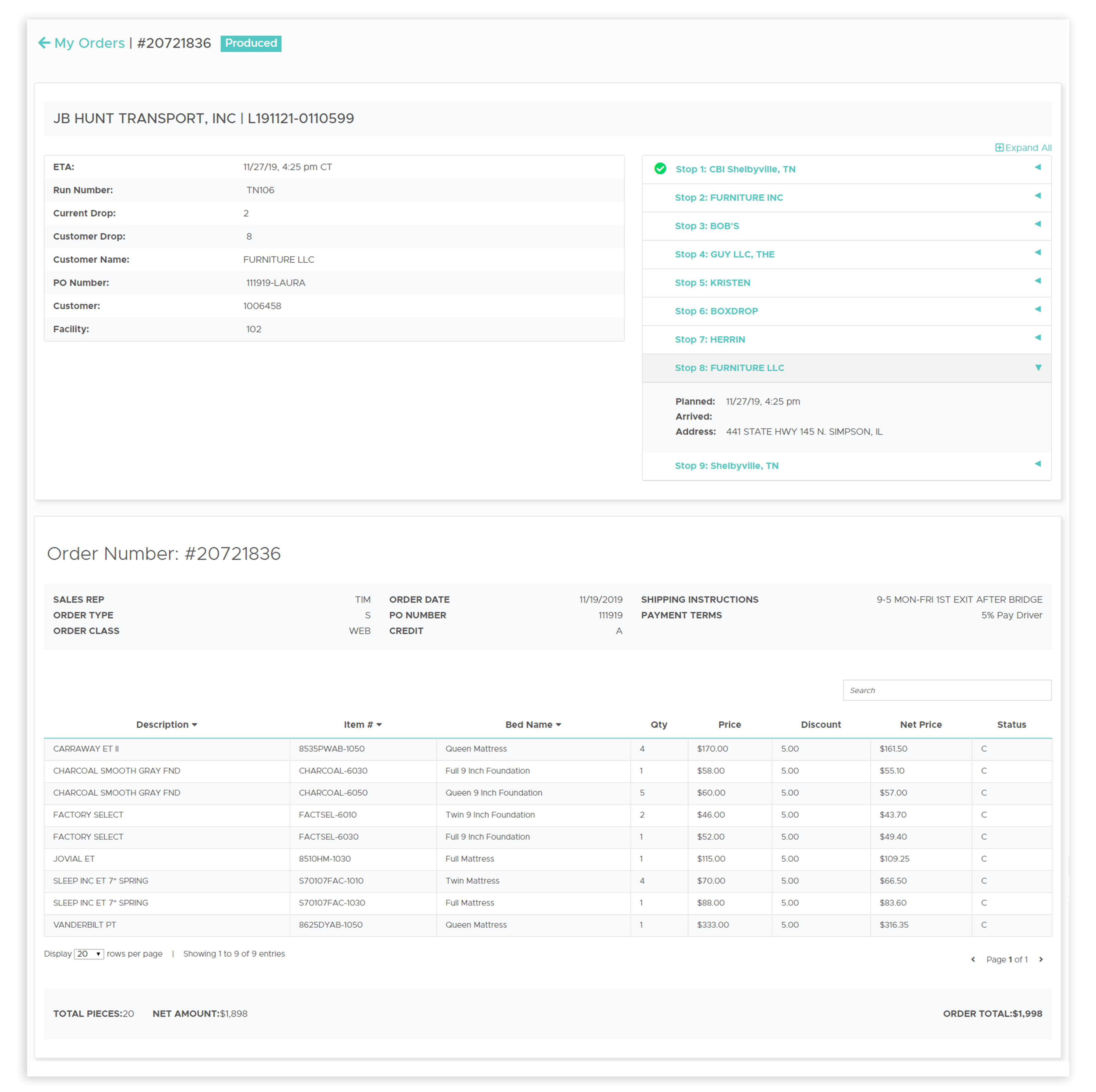
Order Tracker is an application in the GoCorsicana Portal that allows the sales team and customers to easily track orders.
Reasoning
Corsicana's sales team and customers did not have a fast and efficient way to track orders. They relied on customer service for updates on current orders. To improve efficiency and lower customer service cost, Corsicana Mattress created an online application that allowed users to track their own orders.Objective
To create a mobile friendly role-based application that provides the sales team and customers easy access to their order’s details and tracking information.Approach
To create the application my team’s business analyst and lead architect outlined the approach needed to pull order details from the EP system and tracking information from the TMS system.After my business analyst gathered application requirements from the director of sales the processes and requirements were established. After I designed a few low fidelity mock-ups using photoshop and XD of the potential application. My team and I decided on the most efficient and mobile responsive interface. With the designs in hand, I developed the front-end APIs and interface for the tracking application.Role
- User Interface Designer
- Content Designer
- Front-end Developer
DESIGNS
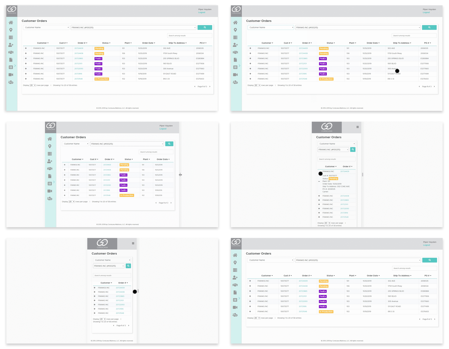
Text Heavy
The order tracker is a data driven application, which means it is text heavy. an interface for a text heavy application comes with its own challenges. One of the biggest challenges faced was how to create an aesthetically pleasing interface that was also effective and efficient when used on both desktop and mobile devices.PRODUCT
FUTURE
Future Users
The current application has only been used by internal employees. As we release the portal to external users the order tracker application must be redesigned to be faster. While the queries are being rewritten to be more efficient, the front-end is being redesigned for two different user types. One design will be implemented for internal users, and the other design will be implemented for external users.About Customer Catalog
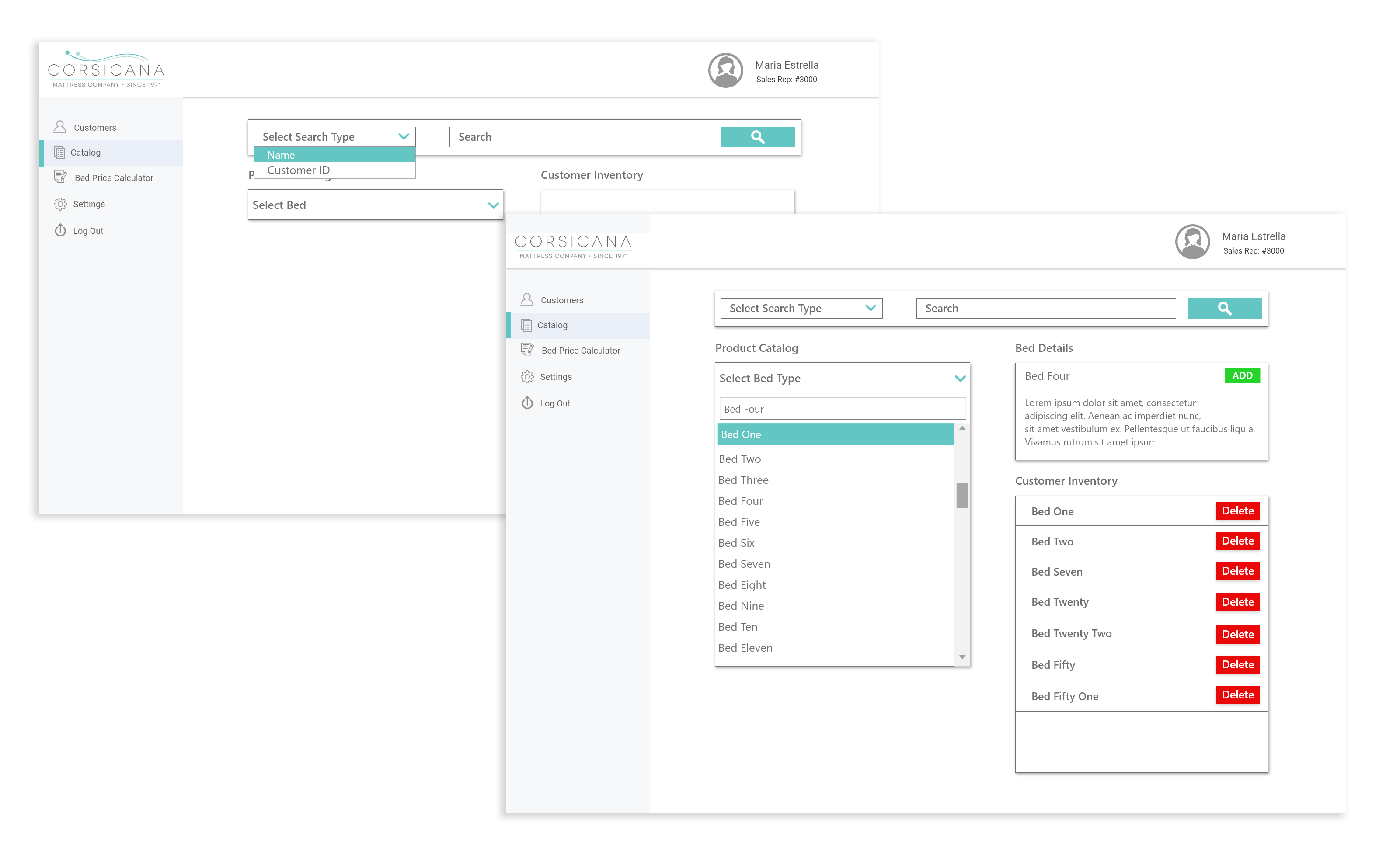
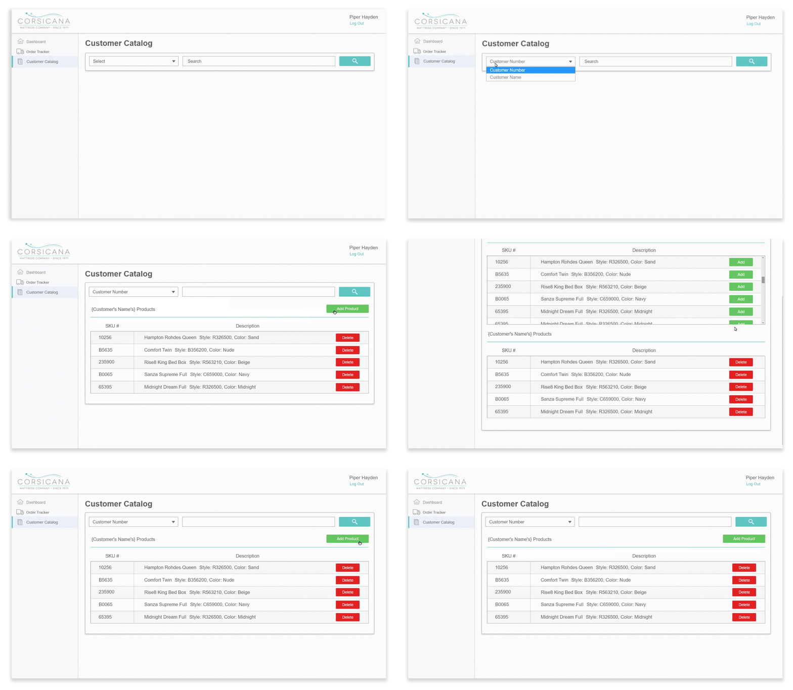
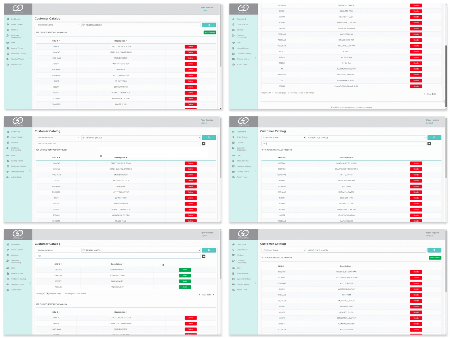
Customer Catalog is an application in the GoCorsicana Portal that that allows sales reps to maintain their customer’s catalogs.
Reasoning
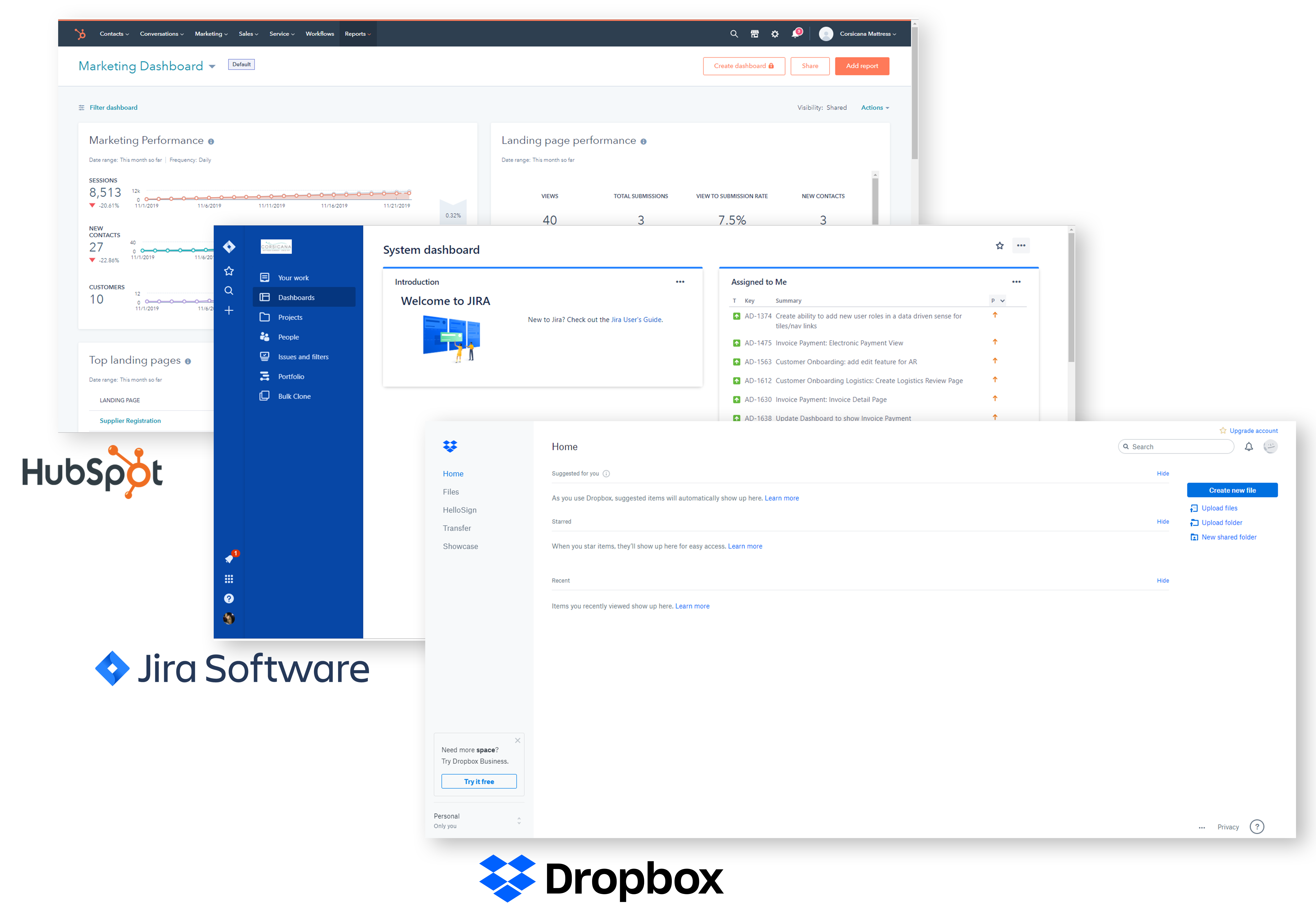
The sales team used three different software services to maintain their customer’s business. To consolidate the number of programs that the sales team was using, an interface for customer catalogs was integrated into the GoCorsicana portal.Objective
To create a mobile responsive application that allows sales reps to maintain their customer’s catalogs.Approach
To create the application my team’s business analyst and lead architect outlined the infrastructure and requirements of the application. Once the processes and requirements were established, I designed a low fidelity mock-up using photoshop and XD. My team members and I decided on the best user interface. The final mock-ups were given to an outsourced team who handled the development.Role
- User Interface Designer
- Content Designer
DESIGNS
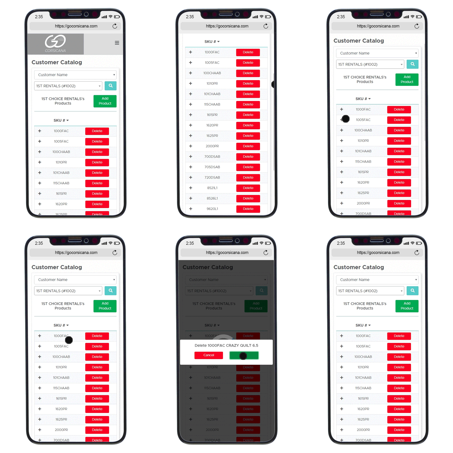
Mobile First
A mobile first design approach insures applications are mobile friendly from the start. Since Corsicana Mattress’s sales team is always on the go, the portals applications must be optimized for their phones.PRODUCT
Custom Table
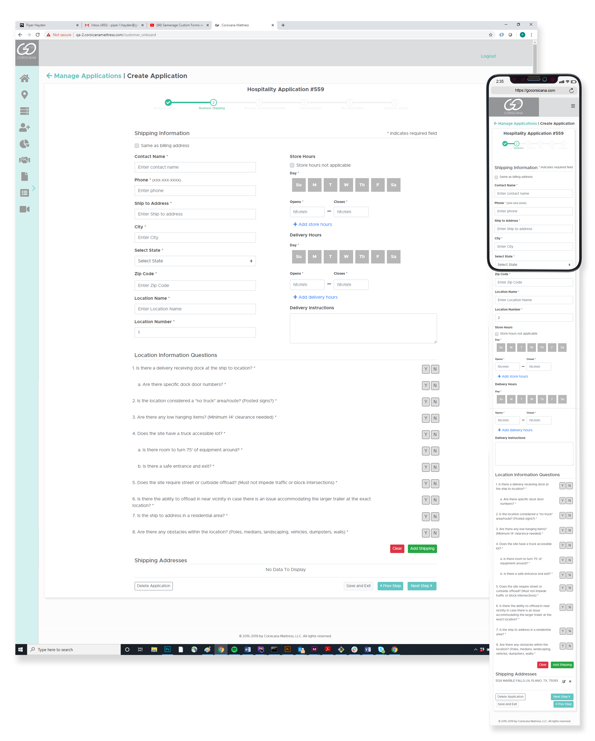
The custom table that my senior developer and I implemented allows all tables on GoCorsicana to be mobile friendly. As the screen's width shrinks columns are removed and the information is displayed within in an accordion.About Customer Onboarding
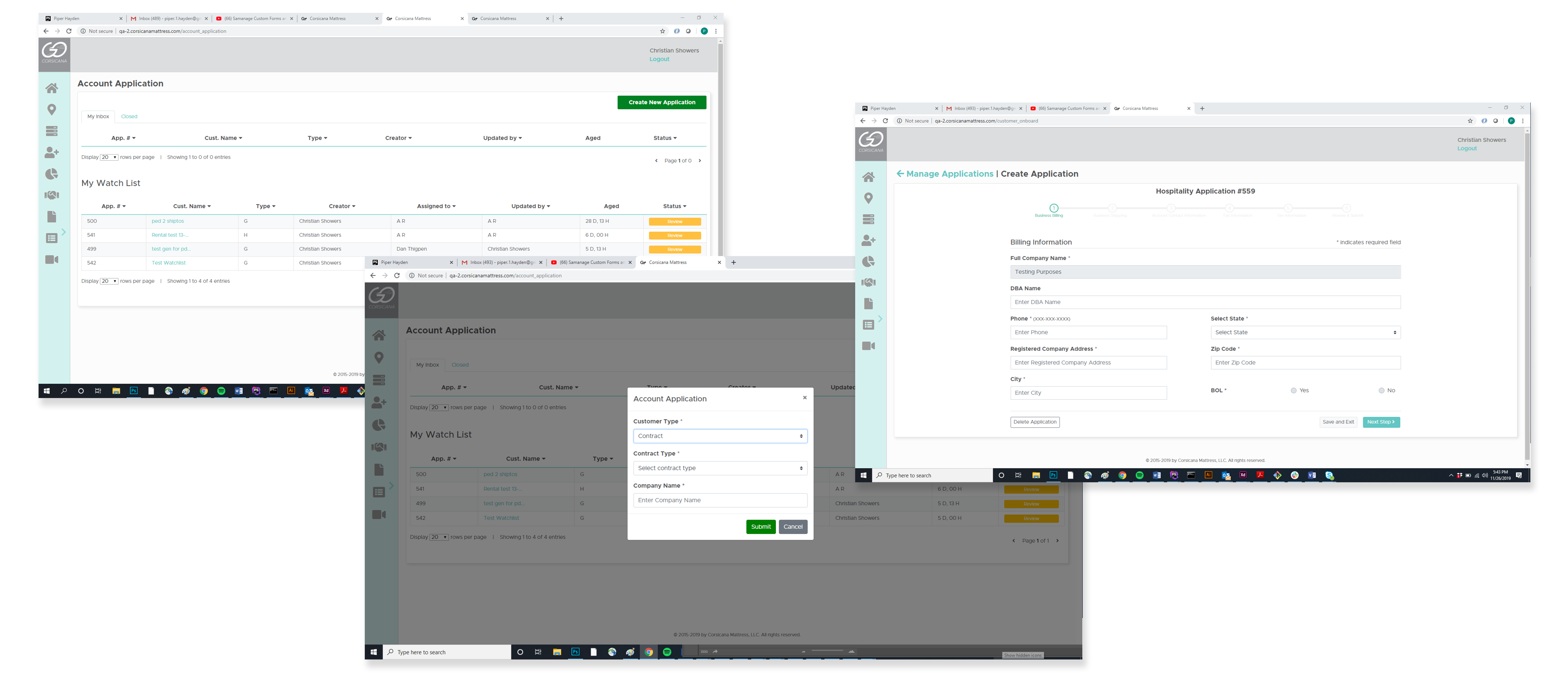
Customer Onbaording is an application in the GoCorsicana Portal that allows sales reps, accounts receivable and logistics to on-board new customers with ease.
Reasoning
The process for on-boarding new customers has become outdated and inefficient. To mainstream the process and reduce the number of man hours needed, it was decided to create an online interface to on-board new customers.Objective
To create a mobile responsive application that allows sales reps, accounts receivable, and logistics to on-board new customers.Approach
To create the customer onboarding application, my senior business analyst and I discussed the current onboarding process with the different departments involved. Once the workflow and requirements were documented we were able to refine both areas of the process to make it more efficient. After the final workflow and requirements were decided I created a few low-fidelity mock-ups of the user interface. My manager and I then agreed on the most efficient design to build. Upon the competition of the mock-up it was forwarded to a outsourced team for developmentRole
- User Interface Designer
- Content Designer
- Project Over Sight
DESIGN
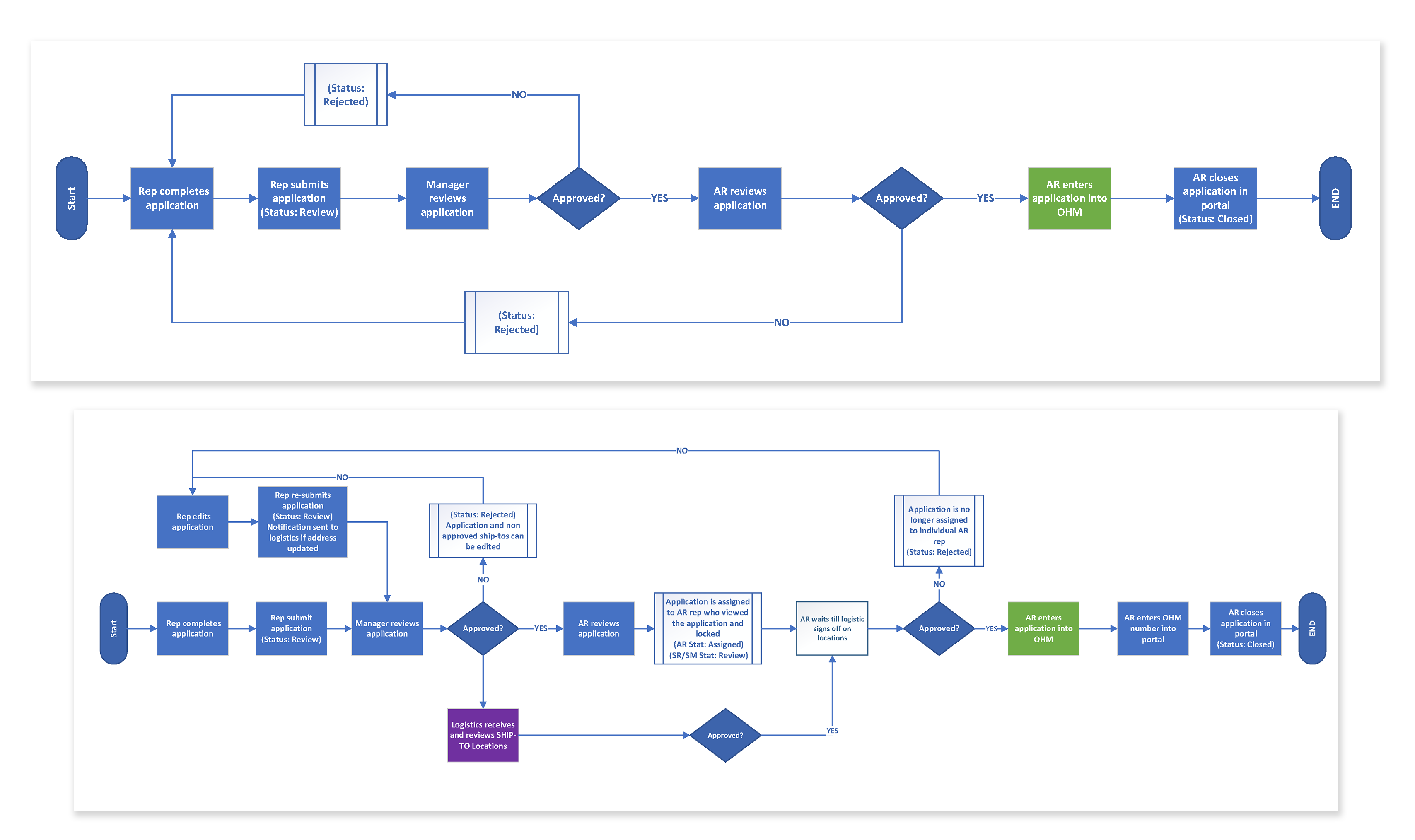
Workflow
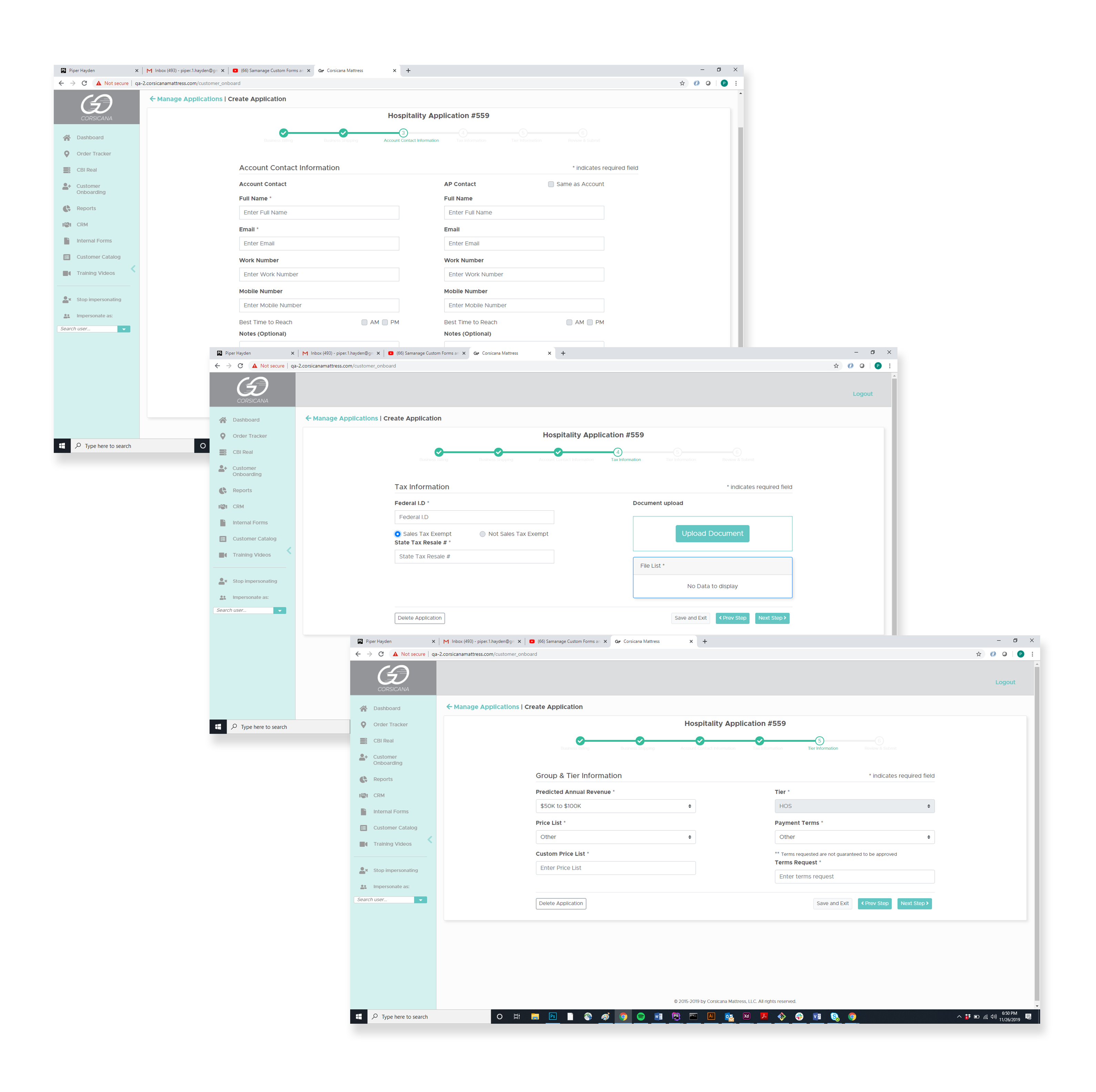
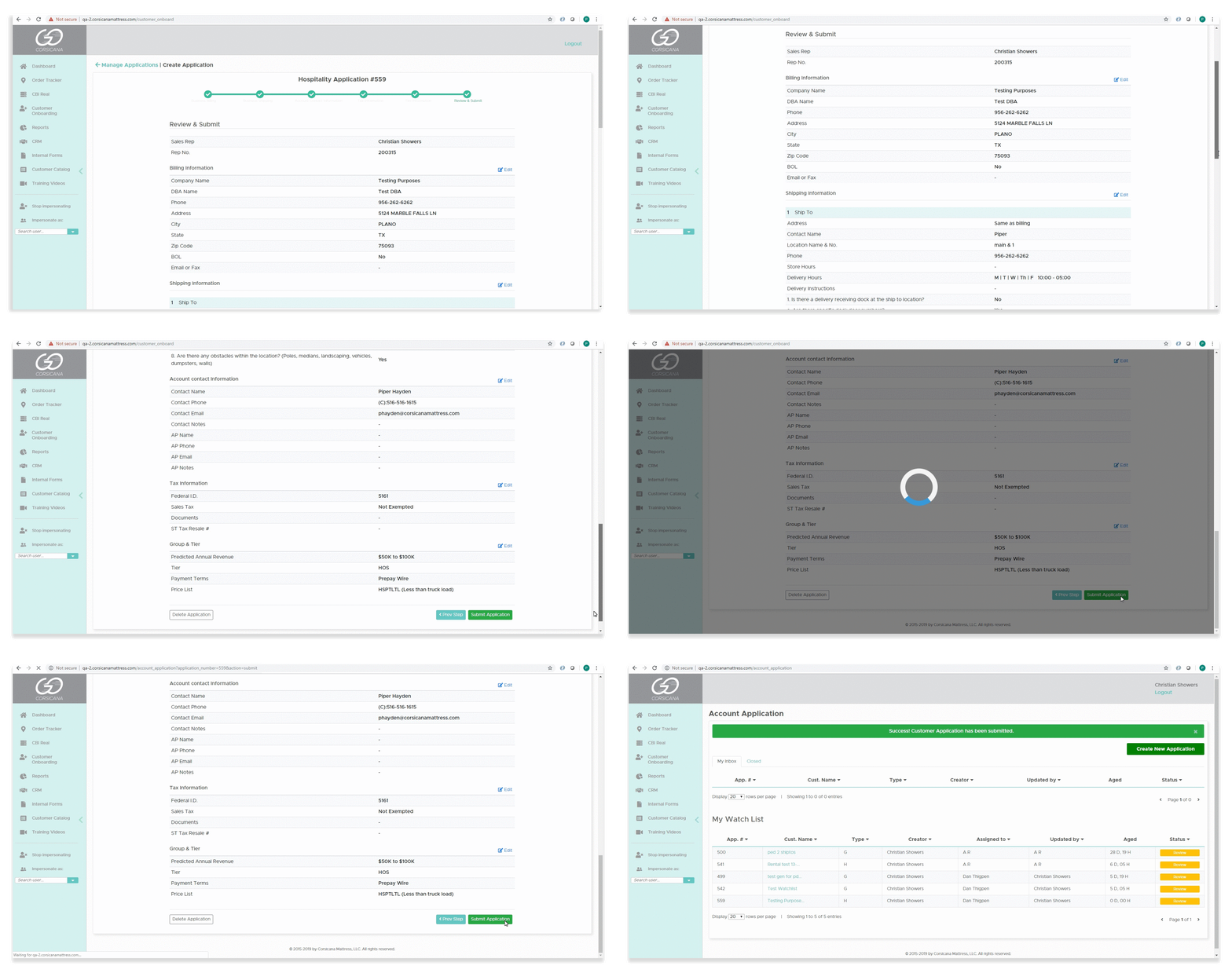
To effectively design an interface one must understand the workflow of the process. The customer on-boarding application involved three different departments who each played an integral part of the process. The final workflow came to existent after multiple iterations of the initial process.PRODUCT
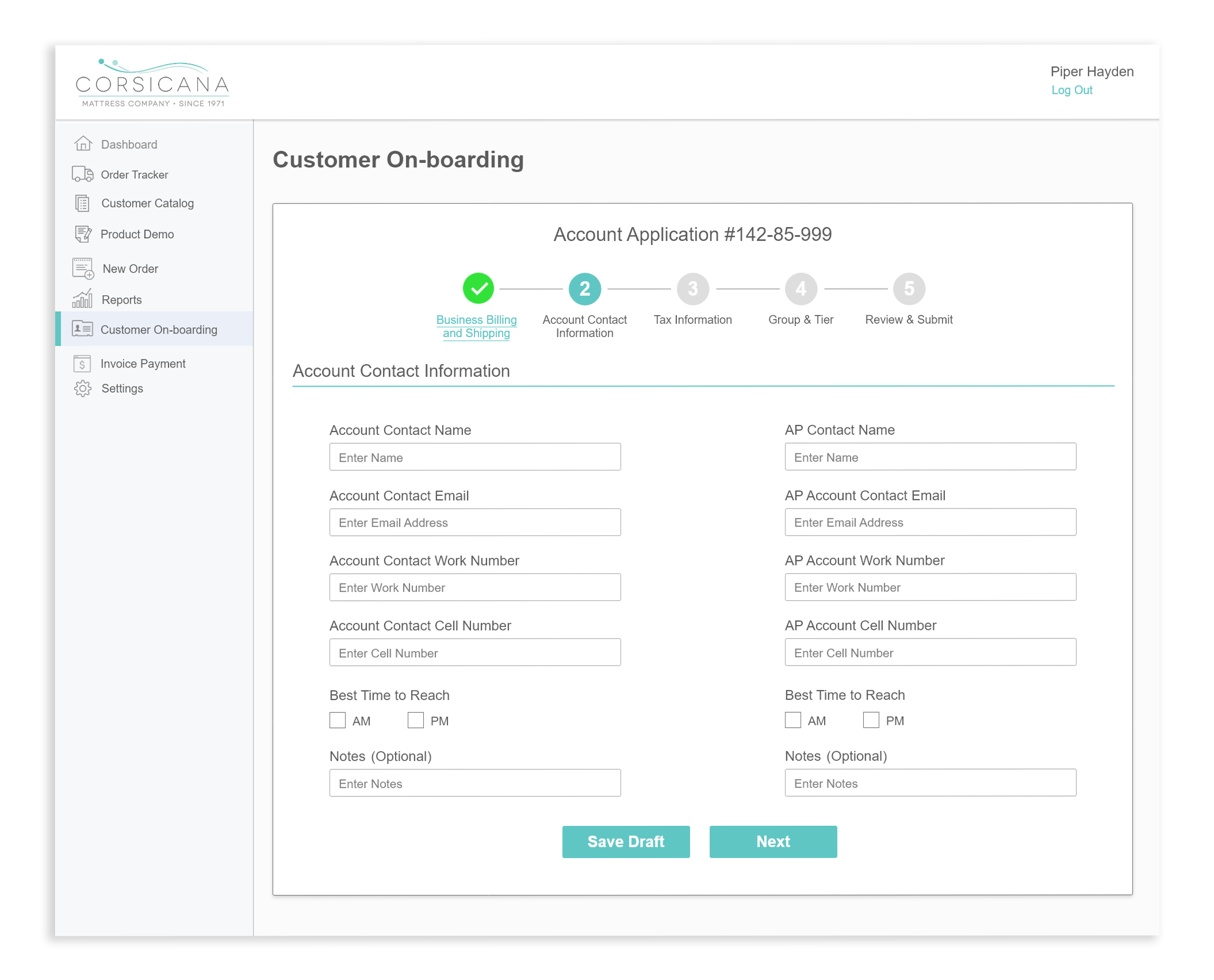
Design Vs. Reality
High fidelity mock-ups become a template rather than a blue print to build from. What is created in Photoshop and XD may not be viable in HTML5 and CSS3. Minor adjustments perfect the final product.